
The website's branding elements are very strong, but there is a lack of user experience knowledge regarding the visual information and organization. Certain items on the website, such as the meal deal information and menu items, are unorganized and cluttered.


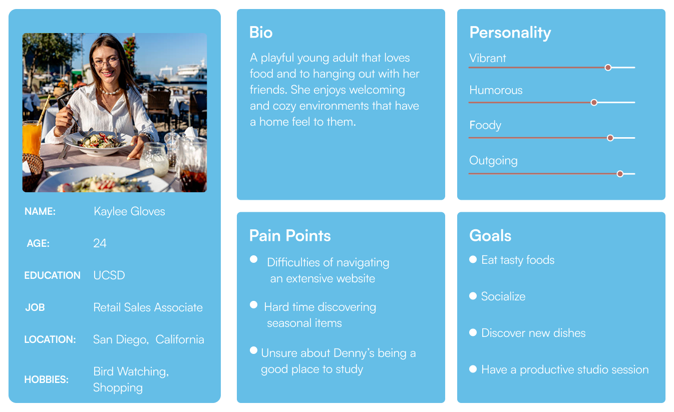
A group of 5 individuals from the ages of 22 to 30 were asked questions pertaining to improvements about the visual aesthetic of Denny’s current website. The participants were asked the following questions:


The execution of this project was satisfactory. However, I would be lying if I said the process went flawlessly. The excitement of figuring out how to create an advanced Hero Carousel outweighed any interest in doing an early draft for the other elements of this project. Luckily, even without multiple drafts of the featured elements, the designs of the section items turned out to be very unique and efficient.